WorkWork
2BeWell Kids is a family bookstore with a carefully curated selection of books and materials that celebrate diversity in ethnicity, religion, culture, neuro and physical abilities, and family make-up. The need was a redesign for the company e-commerce in a challenging timeframe.
Shopify, Photoshop, E-commerce Design, Web Design.
UX/UI Designer @ Colored Byte I was the only designer on this project, together with a PM and developer.
A complete redesign of their Shopify e-commerce within the constraints of an already purchased theme and a limited timeframe of 10 hours, including meetings and feedback adjustments.
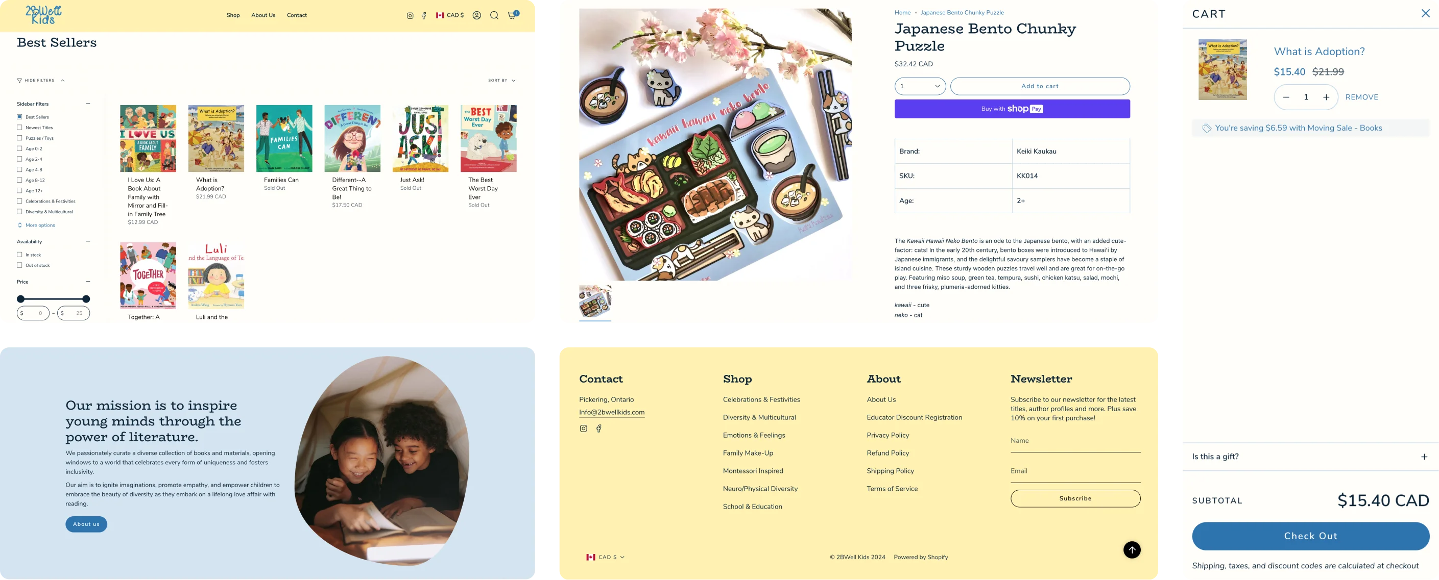
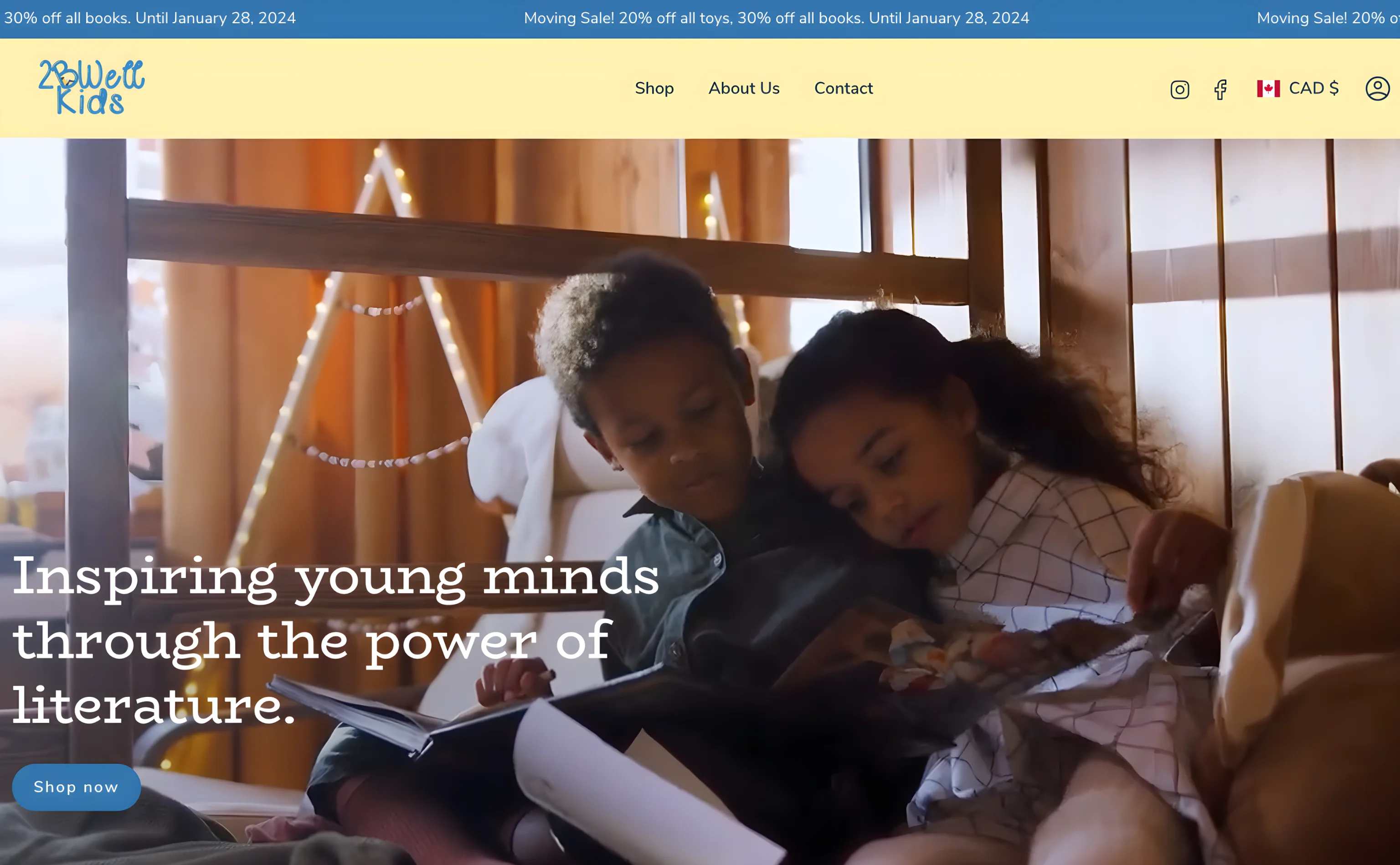
The result was a beautiful website with updated colors and typography aligned with the branding and client expectations. Not only redesigned but also fully functional, conversion-focused, and user-friendly.
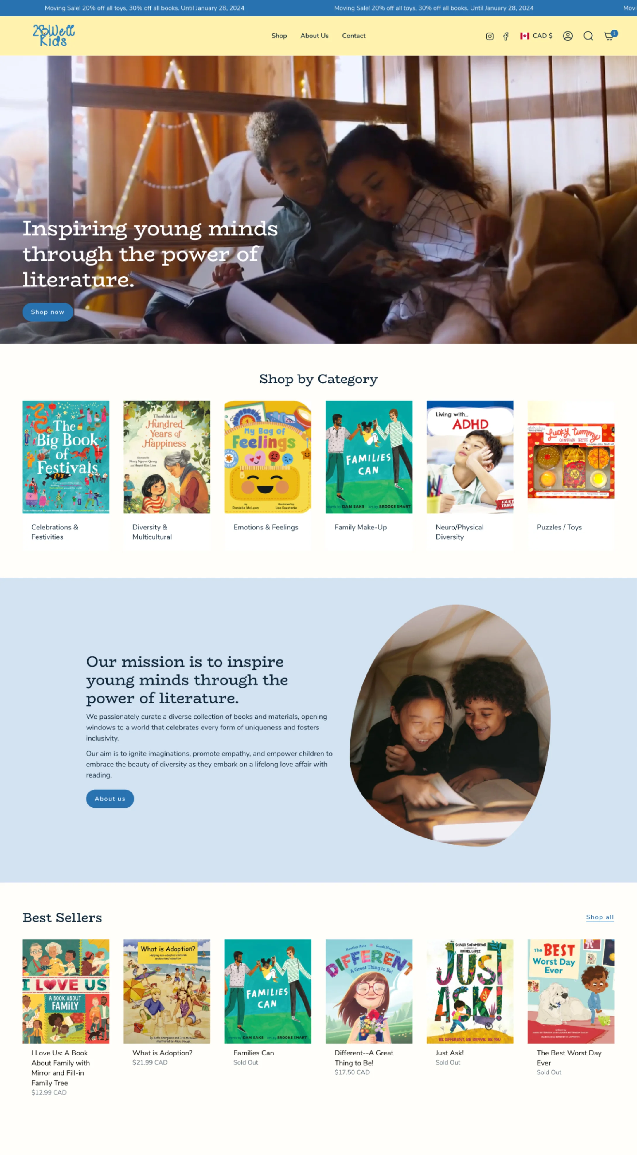
- Product tabs categorized by age for better filtering and navigation
- Product recommendations and last-viewed products to suggest more relevant products
- Sticky "Add to Cart" button for easy buying
- Recommendations for up-selling/cross-selling.
For our first meeting, the goal was to understand some key aspects for the design of the website:
- About the company, their products, their history;
- Their main struggles with the current website;
- Their client personas and competitors;
- Branding guides, assets, imagery, and design-related files;
- Features, apps, or anything specific they wanted to have for the website;
- Design references they had in mind;
- The theme they wanted us to use.
After gathering all the information, it's time to organize everything and start working on the design process.
In Shopify, it is important to pay attention to the theme design, but mostly to the features and level of personalization I wanted for this website to have. For this client, they had purchased Broadcast, a nice theme with a few features that would help improve conversions, such as cross-selling, product tabs, and a sticky product banner.
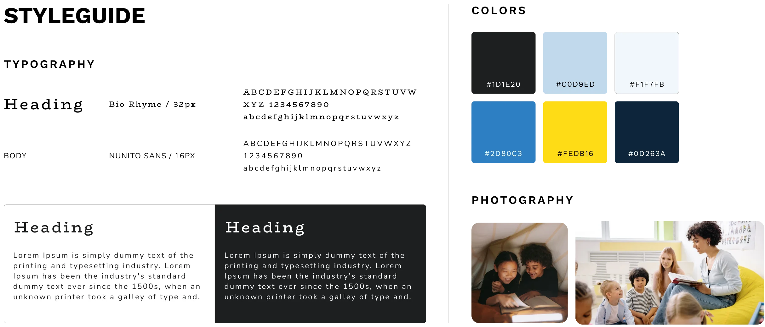
For this website, the idea was to create a clean and simple website, easy to navigate but very on-brand and playful. I conducted a visual benchmarking to understand how their indirect and direct competitors had their websites.
Most of them had a few characteristics in common, and with these in mind, I started creating a style guide that mixed their key words with references from the industry.
The client didn't have any brand assets apart from the logo, which was my main inspiration to create the color palette and play a little with the typography. For this website, the idea was to make a clean and simple website, easy to navigate but very on-brand and playful.
My choices were pastel colors such as blue and yellow, referring to the logo and creating a cozy environment, almost like entering a warm sunny physical bookstore.
For typography, the curvy and large Bio Rhyme for headings and the Nunito Sans for the body completed the playful look and feel.
"Much more practical this way. You leave the class excited after having the experience and can now share it with your colleagues, preventing you from forgetting it for later."
"In general, everything is great, I liked the interaction, the look, everything is simple and quick to do."
"Easy and fast. The page is very interactive, the step by step of what must be done is very simple to follow."
"Too easy, the platform is simple, there is no doubt."
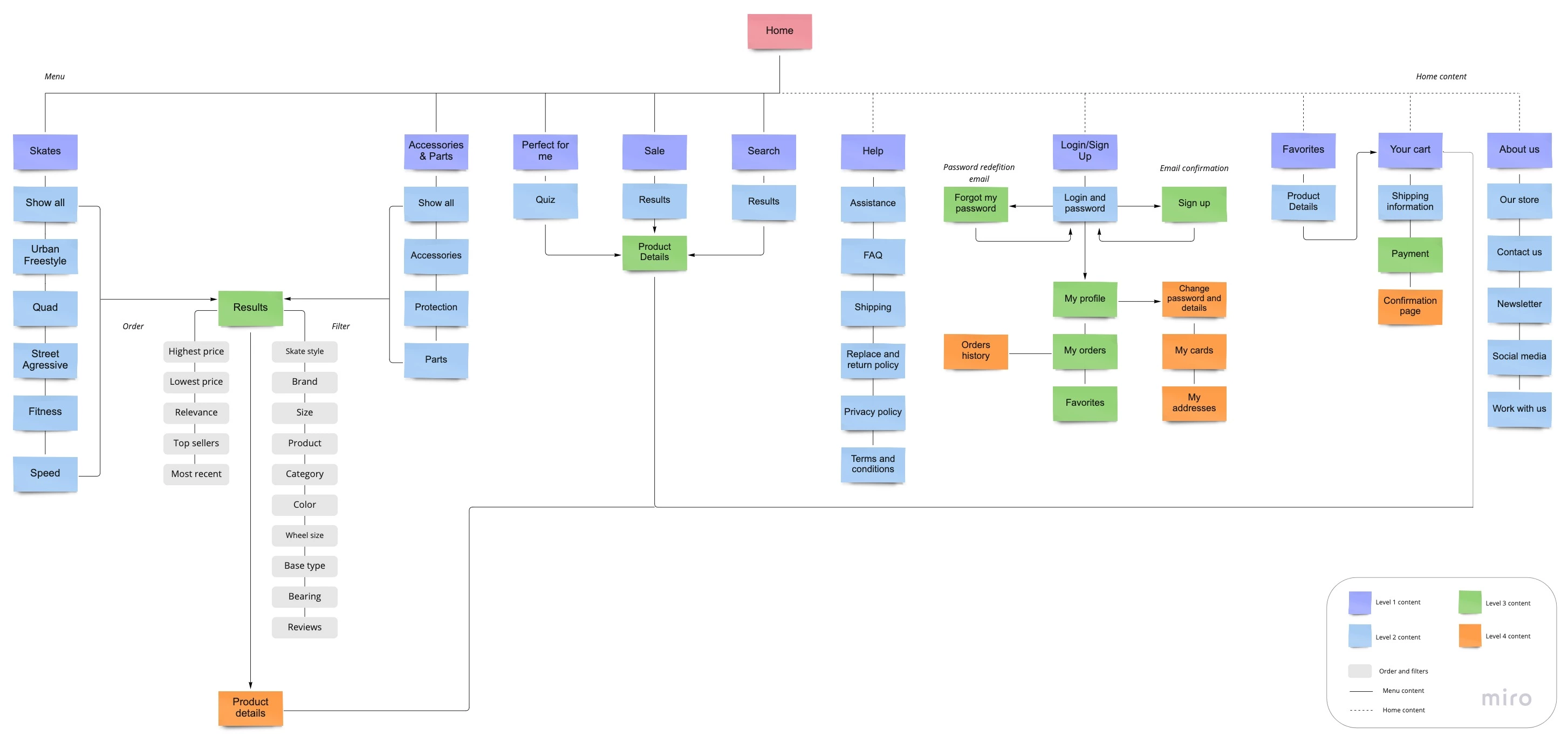
After this process, I created a Sitemap, where I was able to picture the insights from the ideation process in a visual way.The objective here was to have a good foundation to work on the wireframes, which is the next step.
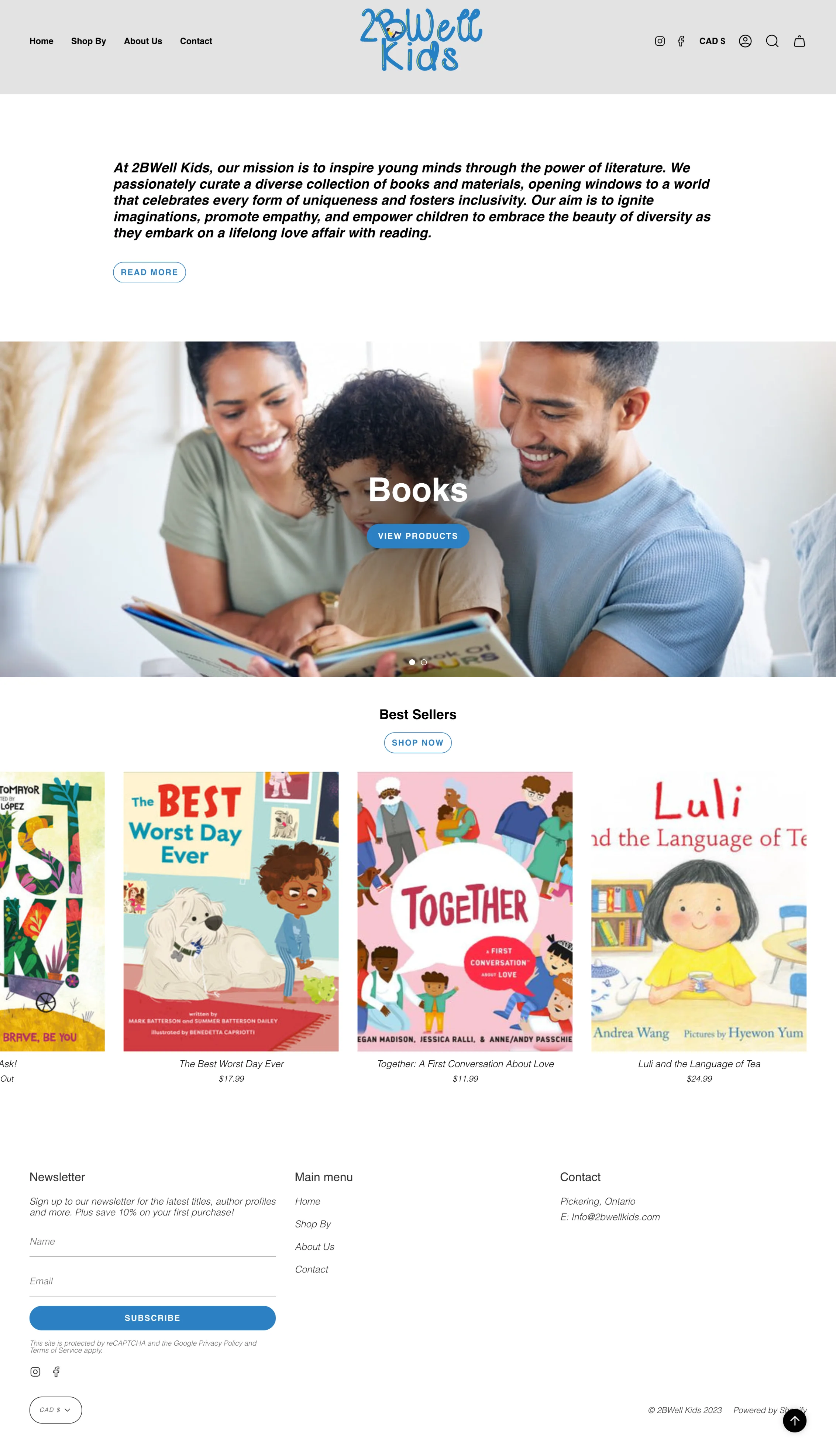
I was able to visualize the entire process so far through the low-fidelity prototype.I started with sketches and after a few versions, I turned them into digital wireframes using Whimsical.

For 2BeWell Kids, I gathered their feedback and other comments with pastel.com so they could analyze everything and pinpoint comments in any part of the interface. They had very small feedback and adjustments, so after those details, the website was ready to launch, and you can see it live now.