 Work
Work Work
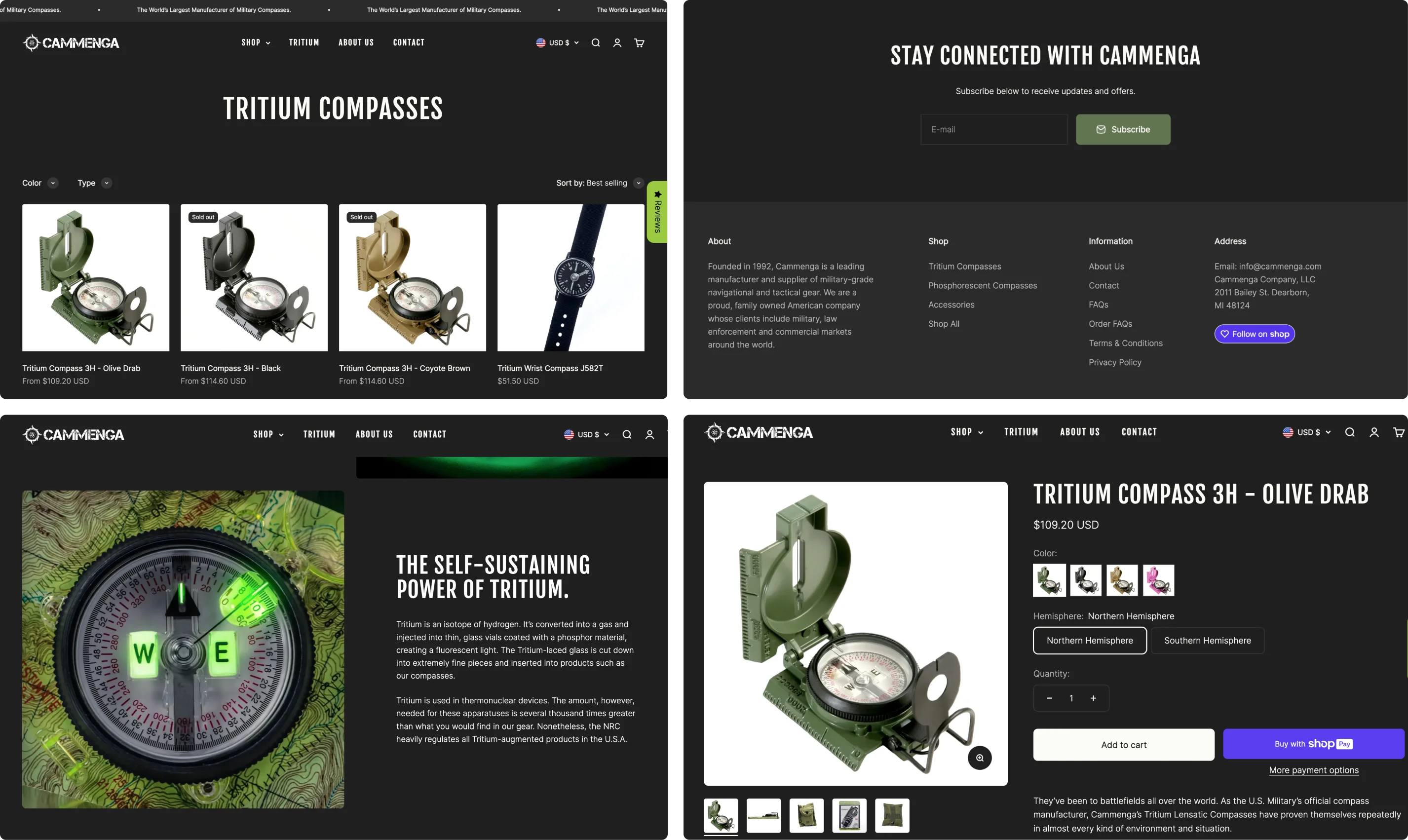
WorkCammenga is an American company based in Michigan and the world's largest military compass manufacturer. In this project they wanted a full new website keeping the heritage and adventure core alive while modernizing the look and feel.
Shopify, Photoshop, E-commerce Design, Web Design
UX/UI Designer @ Colored Byte I was the only designer on this project, together with a PM and developer.
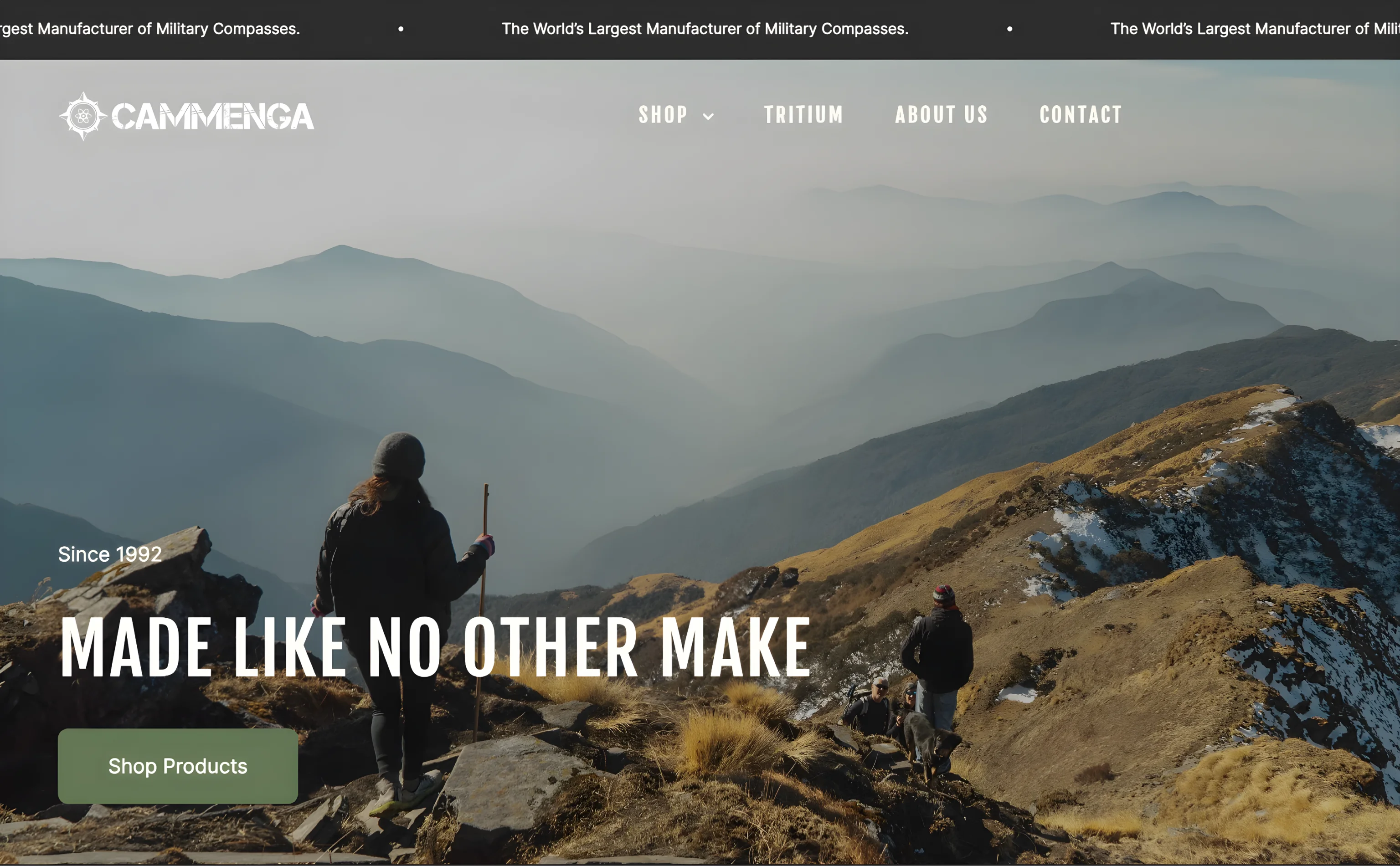
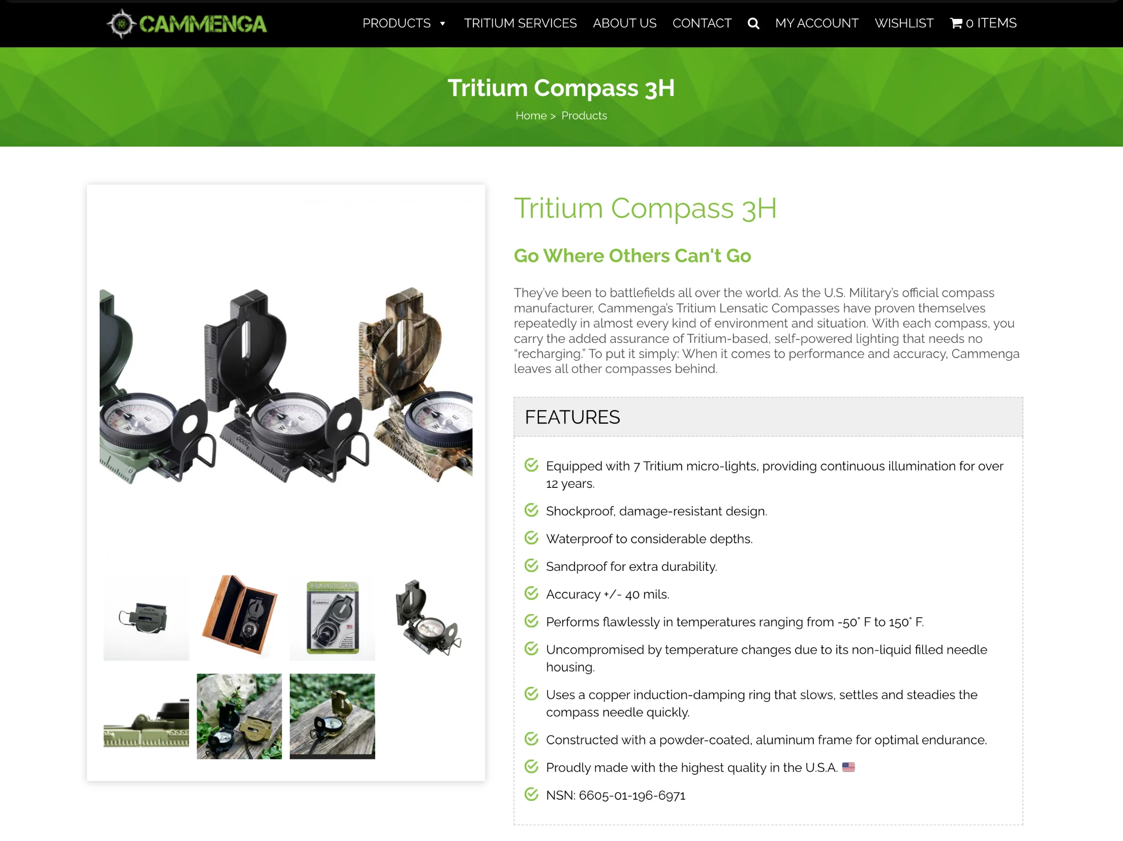
Our challenge was significant: transitioning their store from WordPress to Shopify. This involved building their Shopify store from the ground up, adding products, creating collections, and setting metafields, all while giving the website a fresh, new design, and of course, improving their clients’ experience.
We delivered a fully functional, redesigned website with a focus on usability and conversion, empowering this industry leader to grow and solidify its position.

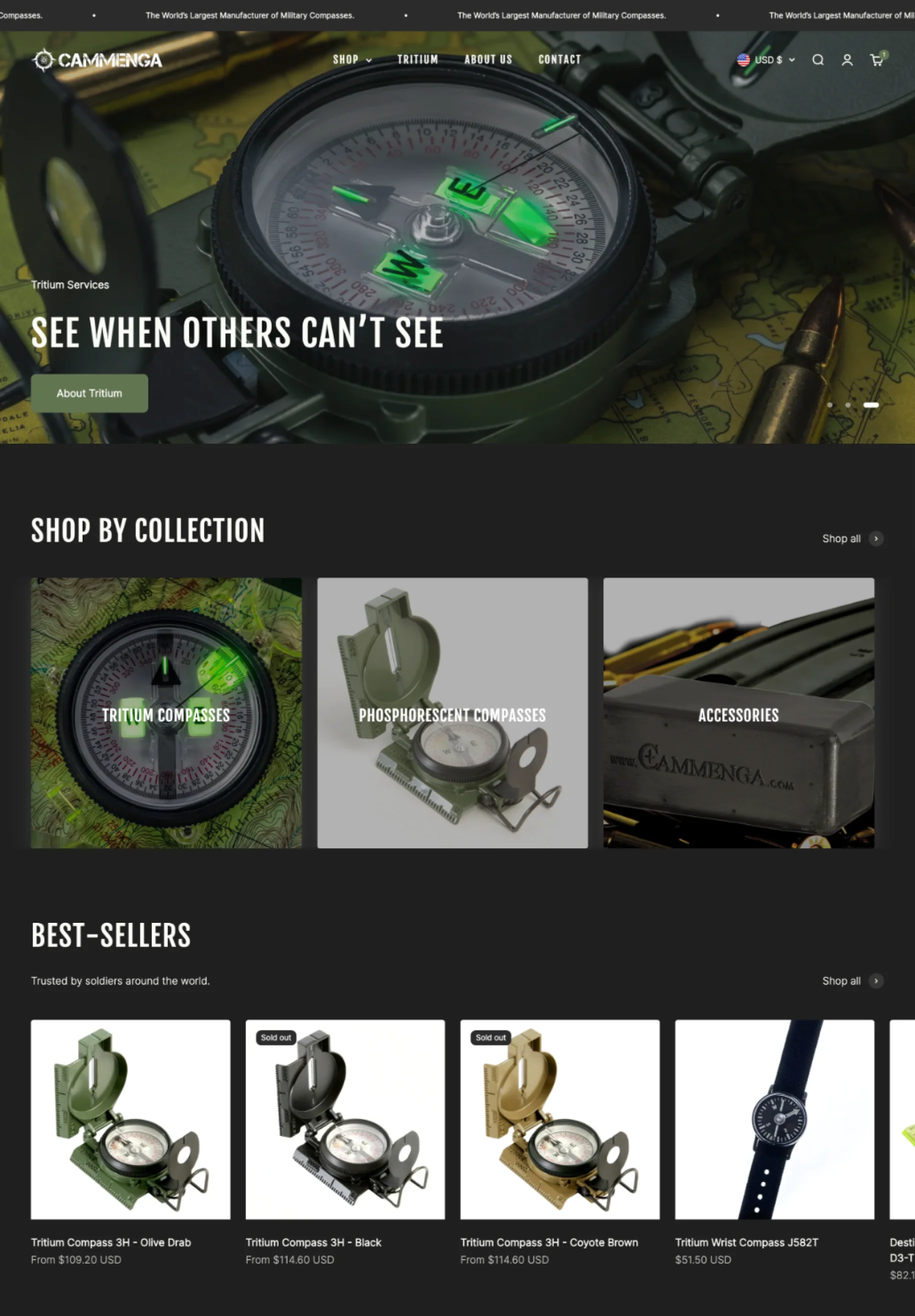
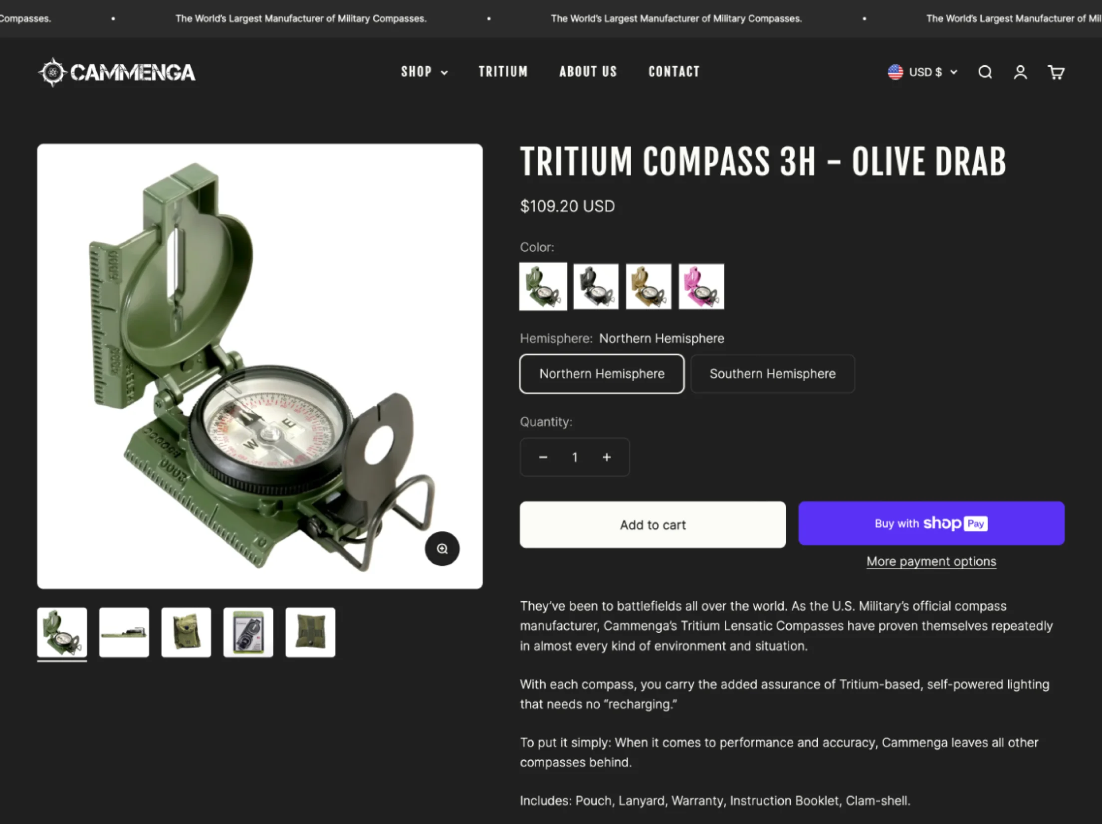

- Hero CTA leading to their best selling products
- Hotspots to highlight the best features of their compasses
- Sticky add to cart button for easy buying
- Cart recommendations for up-selling/cross-selling

In our initial meeting, the goal was to understand key aspects for the website design:
- Company background, products, history.
- Main struggles with the current website.
- Client personas and competitors.
- Branding guides, assets, imagery, and design-related files.
- Desired website features, apps, or specific requirements.
- Design references they had in mind.
After gathering all the information, it was time to organize everything and start working on the theme selection.

In Shopify, it's crucial to pay attention not only to theme design but mostly to the features and the level of personalization wanted for the website.
I decided to go with Impact, a great theme that has awesome features such as a hotspot banner for highlighting features, sticky cart, and cross-selling. Besides, it provides a variety of design settings and a good overall design.
In our initial meeting, the goal was to understand key aspects for the website design:
- Company background, products, history.
- Main struggles with the current website.
- Client personas and competitors.
- Branding guides, assets, imagery, and design-related files.
- Desired website features, apps, or specific requirements.
- Design references they had in mind.
After gathering all the information, it was time to organize everything and start working on the theme selection.
In Shopify, it's crucial to pay attention not only to theme design but mostly to the features and the level of personalization wanted for the website.
I decided to go with Impact, a great theme that has awesome features such as a hotspot banner for highlighting features, sticky cart, and cross-selling. Besides, it provides a variety of design settings and a good overall design.


When asked what makes their product stand out and the feeling they wanted the new website to transmit to their users, we settled on key words: Heritage, adventure, tactical, leading, bold.
I conducted visual benchmarking to understand how their indirect and direct competitors designed their websites. Most of them had a few characteristics in common. With these in mind, I started creating a style guide that mixed their keywords with references from the industry.
The client was open to color and typography suggestions as long as we kept the logo original.
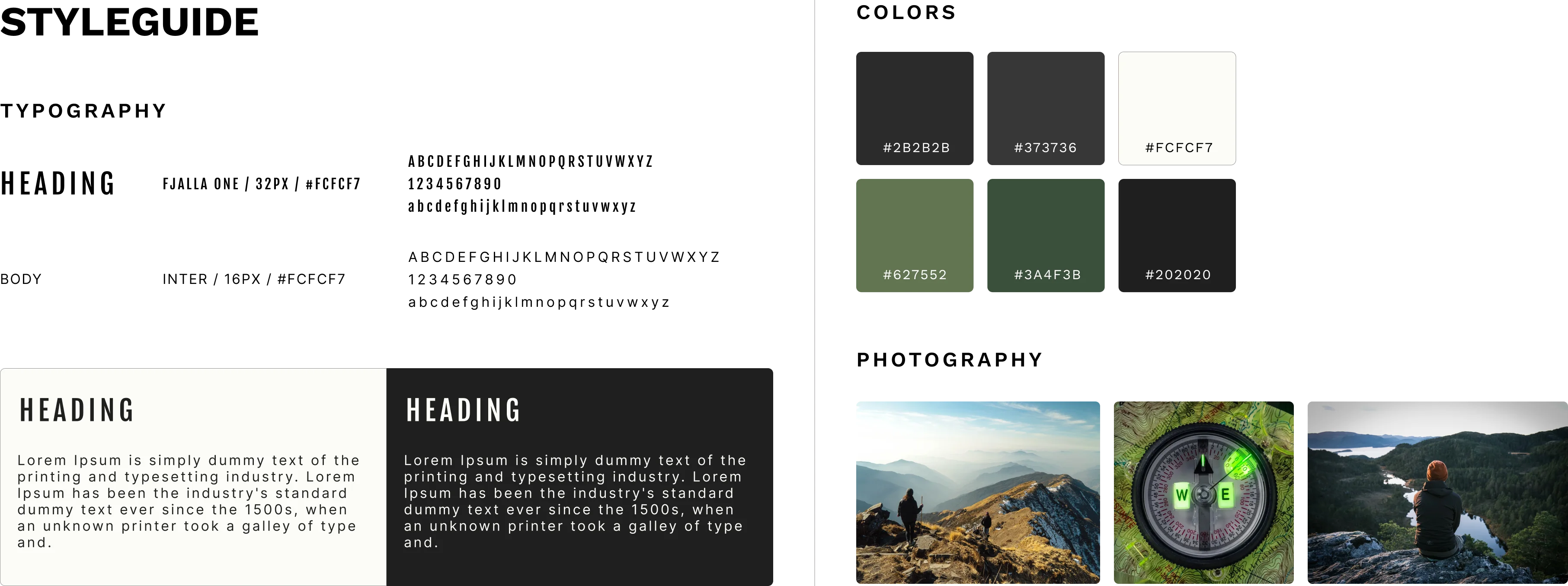
To create the adventure and tactical feeling, I opted for dark gray and black, along with the green from the woods their clients usually explore with their products. To add contrast, a light yellow-ish white was chosen, adding warmth to the palette.
For typography, the boxy bold style of Fjalla One for headings and the classic and accessible Inter for the body completed the adventure and bold look and feel.
"Much more practical this way. You leave the class excited after having the experience and can now share it with your colleagues, preventing you from forgetting it for later."
"In general, everything is great, I liked the interaction, the look, everything is simple and quick to do."
"Easy and fast. The page is very interactive, the step by step of what must be done is very simple to follow."
"Too easy, the platform is simple, there is no doubt."
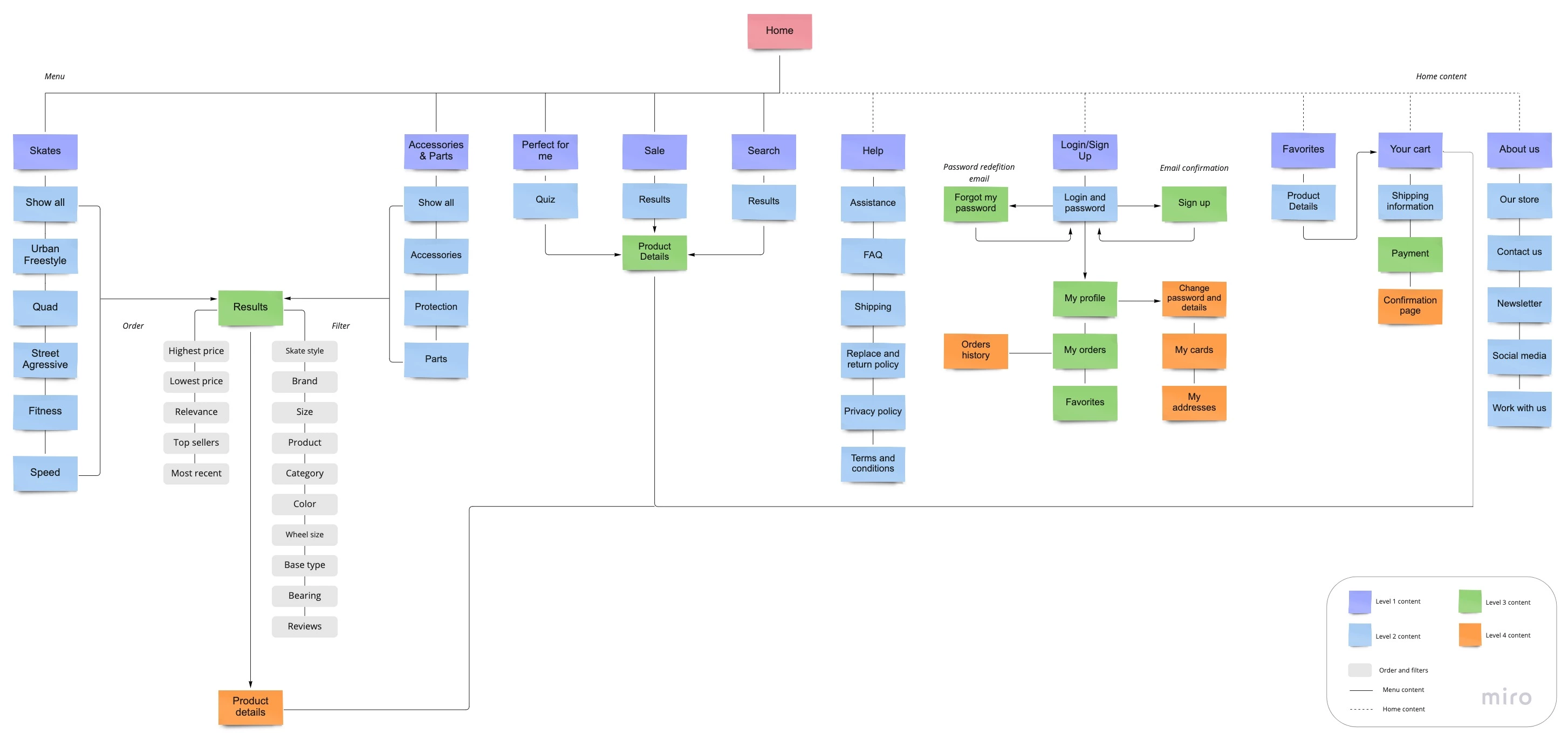
After this process, I created a Sitemap, where I was able to picture the insights from the ideation process in a visual way.The objective here was to have a good foundation to work on the wireframes, which is the next step.
I was able to visualize the entire process so far through the low-fidelity prototype.I started with sketches and after a few versions, I turned them into digital wireframes using Whimsical.

For Cammenga, I presented the first version of the website, explaining my process and design rationale behind my choices. For this meeting, we usually received general feedback, and for in-depth comments, we used pastel.com so the client could analyze everything and pinpoint comments in any part of the interface.
With all the feedback in hand, I made all necessary adjustments for design and content, and the result is a fully functioning and user-friendly website.
